
TrueTour®
Context
The Agency: Pancake Creative, a boutique digital agency in Portland, Oregon
The Client: Visiting Media, a leader in the field of immersive digital marketing
The Product: TrueTour, the centerpiece product of Visiting Media’s full-service, membership-based, all-in-one digital media solution for venues. It is a very successful virtual brochure platform for mobile, tablet, desktop, and VR, with 4.5 million users, that allows member venues to upload, manage, and share all their 360˚ photos, 3D models, 360˚ video and other media
The Problem: Because of the platform’s early success on the market, much of the design, especially the logged-in portion, was done hastily, thereby causing numerous pain points
My Role: Lead UX designer and researcher, tasked with redesigning the logged-in, member experience and UI (the “backend”)
Duration: The project lasted ~6 weeks

Existing front-end, logged-out interface, showing side-panel menus
Early Challenges
Because my fellow designer and I were interns whose competence was unknown to the client and product, the client was understandably hesitant to trust us initially. They were in no hurry to grant us access to their analytics, nor their customer support records, nor their users. This meant we couldn’t survey users about frustrations, nor could we do any sort of usability testing with existing users. This was a major hurdle to overcome. And the challenge, moving forward, was two-fold: 1) accurately assess the weaknesses of the existing product without the benefit of many traditional UX research methods, and 2) quickly gain the trust of the client.
I expressed my concerns to my supervisor about these extreme constraints and he was able to arrange for us to meet with the client’s marketing and design lead in week 2. In the days leading up to that important meeting, my fellow designer and I carried out a plan to learn as much as we could about the product and its pain points. In order to do this, we devised a strategy that, by necessity, had to flout certain UX principles, like “the designer is not the user.”
Pain Points & Design Guidelines
Without direct access to actual users, we had to become the users and do usability testing on ourselves / each other. We screen-recorded ourselves completing the registration and onboarding process, using the think-aloud protocol. Once we had onboarded and worked through various logged-in dashboard tasks, my fellow designer and I swapped screen recordings and made notes on all the ways the user struggled to accomplish their goal and/or expressed frustration.

User testing. The conventional form format is representative of the entire logged-in interface.
We then catalogued these pain points according to similarities, and created a user journey map.

Journey mapping: analog and digital, post-its and Smaply
Then based on the categorized pain points and user journey map, we generated some design guidelines to focus our imminent re-design efforts. Some of these guidelines are fairly general and follow UX best practice, others are very specific and address particular weaknesses or inconsistencies in the existing UI.

Custom design guidelines — some very general, some very specific
As is often the case for me, thoroughly exploring and defining the problem space tills my brain’s soil for something new to sprout; it readies the brain for inspiration (see UI Innovation, below).
The Meeting
Our week 2 meeting with Greta, the client’s marketing and design lead, deepened my understanding of the company’s business model and goals and extended my understanding of the product. I was able to begin building some trust with her, too, as she saw that I was insightful about her product and had TrueTour’s best interests in mind. She agreed with many of my observations about the pain points for users—most notably the inability to easily preview changes in the front-end (customer view) that were made in the back end (logged-in venue view).
We also learned of an upcoming “bootcamp” the client was hosting to strategize with their whole team and our dev team, to do some big-picture thinking and get everyone on the same page. So, after the meeting with Greta, recognizing that I had demonstrated my value to the client, and knowing that we were doing some really important design work, I lobbied to be included in that bootcamp. They agreed to let me lead a 2-hour session. So we began to prepare some deliverables that would facilitate big-picture discussions with the whole team.
UI Innovation
With many of the biggest problems and opportunities revolving around the disconnect between the back end (logged-in view) and the front-end (customer-facing brochure), it became apparent that the best solution would be to align backstage and front stage. Furthermore, their mobile experience was no different than desktop—that is to say, it was woefully difficult to use on a small screen and didn’t take advantage of the inherent advantages of the platform, like gestures. So, focused on mobile first, we spent the next week or so imagining how to make that logged-in experience mirror the customer-facing experience and designed low-fidelity wireframes to demonstrate this major paradigm shift.
Participatory Design Workshop
After giving a brief presentation on our process and our findings on the pain points that necessitated our redesign, we invited the team to circulate the room, writing Post-It comments or questions next to the posted wireframes, or drawing directly on the butcher paper on the walls. The room was electric with creativity and energy!

Dev team members riffing on our ideas at the workshop. Inset: Slack screenshot showing the client’s marketing and design director’s excitement
Not only did we glean some great insights and ideas from different viewpoints, but more importantly we got full buy-in from the entire team. Everyone saw the need to align the front-end and backend experience, and, also now seeing some of the limitations of the current front-end design, they invited us to go a step further and redesign the front end, too!
The Redesign
With only 2 weeks left in our internship, we began our UI overhaul by making low-fidelity wireframes, first for mobile then desktop, to get the general layout and make sure the user flow between screens and states was sound. Lastly, we created high-fidelity wireframes for mobile. My biggest innovation in the new UI was the introduction of a customizable rotary menu in the bottom corner of the mobile screen. Occupying the most convenient space for a right-handed thumb, all navigation options are now a click away. Swiping the larger quarter circle that emerges will spin the rotary menu, revealing nav options. It is an elegant solution for a UI in which showcasing content is paramount but that also has a lot of navigation options.

Low-fidelity wireframes & mobile UI navigation flow
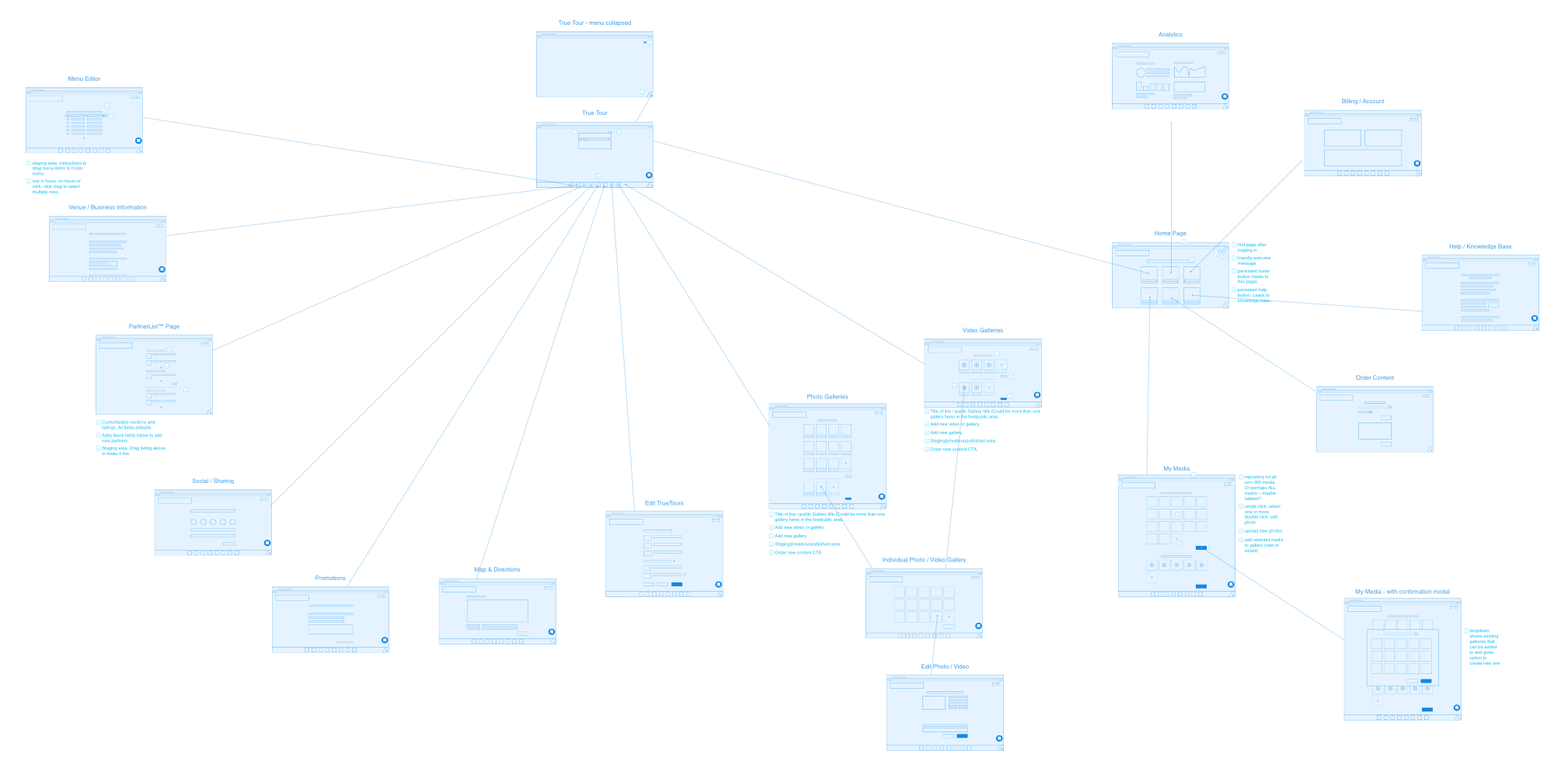
Low-fidelity wireframes & desktop UI navigation flow
The high-fidelity wireframes we made next (below), follow Visiting Media’s existing brand guidelines but add plenty of freshness to the product.

High-fidelity mobile wireframes / mockups
Conclusion / Summary
All in all, I am extremely proud of what I was able to accomplish and am gratified that my coworkers, supervisor, and clients were very pleased with my work.
My biggest regret was that I never gained access to the client’s analytics or users. Beyond the advantages those early insights could have given our design process, we missed out on setting benchmarks that would enable us / them to accurately assess the new design’s successes and failures.
Had I had more time on the project, I would’ve prioritized the creation of brand-compatible and usability-enhancing UI animations. Especially for a UI innovation like a rotary menu, which many users may be unfamiliar with, some simple animations could go a long way toward its discoverability and usability.
As I write this in 2018 the project is in development and I wish the Pancake Creative team the best in bringing my baby to life!

LinkedIn recommendation from my supervisor, the CEO of Pancake Creative.